Did you recently receive your 2020 CPT Manual with yellow dots all over it? Was it a misprint? Did you maybe receive a bad copy of your CPT Manual?
Actually, according to an email we received from the AMA today, it’s none of the above. The AMA explained that the yellow dots are a new copyright technology called “SEClipse pattern” intended to prevent copying and scanning.
Here’s the full release issued by the AMA:
For those if you that cannot read the small text in the image above, here are the contents of the AMA email:
What is the AMA Doing to Combat Counterfeiting?
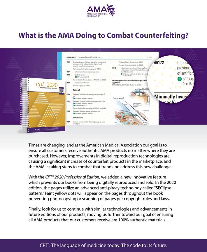
Times are changing, and at the American Medical Association our goal is to ensure all customers receive authentic AMA products no matter where they are purchased. However, improvements in digital reproduction technologies are causing a significant increase of counterfeit products in the marketplace, and the AMA is taking steps to combat that trend and address this new challenge.
With the CPT® 2020 Professional Edition, we added a new innovative feature which prevents our books from being digitally reproduced and sold. In the 2020 edition, the pages utilize an advanced anti -piracy technology called “SEClipse pattern”. Faint yellow dots will appear on the pages throughout the book preventing photocopying or scanning of pages per copyright rules and laws.
Finally, look for us to continue with similar technologies and advancements in future editions of our products, moving us further toward our goal of ensuring all AMA products that our customers receive are 100% authentic materials.
Do you like the new yellow dot pattern? Are you having difficulty reading the pages now? We’d love to hear your comments below.
It reminds me of money. It was a little bit distracting at first- I don’t mostly like it, but you have to do what is necessary.
I opened the book today and thought it was a a misprint or error or counterfeit book made. Then I goggled it and saw this. It is very distracting and it makes all the text seemed to blend in. it was very hard on my eyes reading it. I would think there could have been something else to do to prevent it from being copied. It also looks like they made the page and print color not as defined and lighter and definitely smaller.
We’re getting headaches over here as well. And we’ve also noticed that the colors don’t properly bleed over each other also.
I do not like the yellow printed dots within the books. The AMA is doing everything to protect copy right on their behalf; however, they should reduce the price as a result of the poor quality
I find the yellow dots distracting. The text is more difficult to read The print is small and adding the dots has made reading all the more difficult. Did they use a test group before making the changes?
We are not sure if they had a test group. We were quite surprised when we saw the yellow dots and requested reprints thinking it was a print run error. That’s when we were told they were a security feature. :O
I just now figured out after taking a review class for the CPC and looking at the book for a few hours, that I couldn’t read it. I do not need glasses to drive but do have ‘dry eye’ and some distortion from RK and PRK years ago. I wondered, had I missed those dots before? No, I opened my new 2021 book and NO YELLOW dots except where there isn’t text. I have to take my test with the 2020 book and may have to use a magnifying glass, or just strong ‘readers’ only. THIS was a terrible thing to do with an already ‘SMALL’ font!